
There is an old ‘saying’, it comes from the late 70’s and it goes a little like this:
There are three ways to lose your company:
Through women, which is the prettiest method.
Through gambling, which is the fastest method.
Through Statistics, which is the most certain method.
In the 50 years that followed we learned that the first option might be the prettiest, but you still end up with a working company. The second one is still an issue, but the third one is still under consideration, Especially with the presumed setting of AI (or as I call is NIP or Fake AI.
This all came to me when I was bombarded with charts and there are numerous ways that we are handed these charts, but it also gave me a consideration. You see, no matter how deep you believe the data to be true, it remains a consideration that any data is flawed and through that setting not entirely trustworthy.
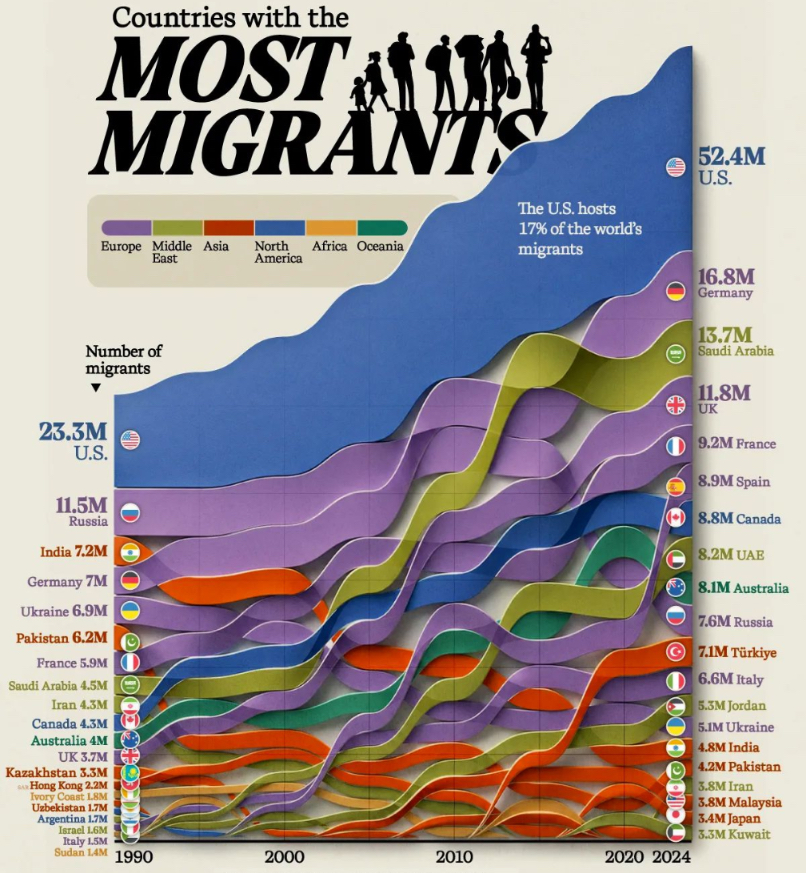
You see, this is the country with the most migrants, but what I am missing is where they came from. I saw another article in the BBC, which gave us ‘La dolce vita: Is Italy the new tax haven for the global rich?’ (at https://www.bbc.com/worklife/article/20260421-is-italy-the-new-tax-haven-for-the-global-rich)here we see “In France you also have to pay a property tax (taxe foncière or land tax). “We don’t have that here for the prima casa (first home),” says Robert, although he notes “there is a high charge for refuse collection”. The best thing as far as he is concerned is that there is no inheritance tax on property you own in Italy up to €1 million ($1.1 million) and it’s only 4% beyond that threshold. In France the tax-free limit is much lower – €100,000 ($110,000) – and beyond that it’s a sliding scale up to a top rate of 45%.” The story is about the ‘global rich’? All this might be true, but I believe that there is a larger migration into Europe. The setting that Americans are leaving, a setting we got in the Wall Street Journal on February 25th 2026, where we saw “The U.S. experienced net negative migration in 2025, with an estimated loss of 150,000 people, a trend not seen since the Great Depression.” And if you are ‘really wealthy’, you skip Italy and go straight to Monaco, which is a zero tax nation. So that first chart is nice, but where they came from is more interesting, especially in the era 2026-2028.
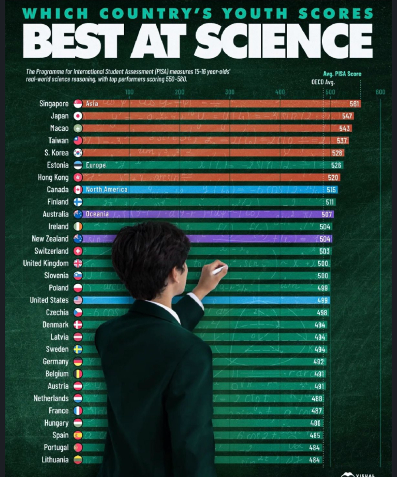
We then get the second chart, which shows us where the youth is scientifically. Here we get the first issue. There is consideration that these numbers are flawed n some cases. As some give us: “There are approximately 1.2 billion young people aged 15 to 24 globally”, and I know enough of the failing of data, to give you the fact that there are no data sets giving us 1.2 billion records. As such plenty of nations have worked with mean values and that is the first failing on that chart. Second it is nice to see the USA in 17th position, but they have a population of 349 million and not all can afford to go to University, then we get foreign students in MIT, UCLA,
Princeton, Harvard and Yale. So how are they counted and what is disregarded? Several questions on a chart because the data is missing (and footnotes too). So whilst these numbers might be indicative that those scoring over 500 are in a ‘safe’ place, but that is if we accept this number. And the explanation of those scores, with added footnotes on what is regarded as ‘valid’ is up for grabs.
And then we get the main event, the one that baffled me for a moment, because is gave my thoughts optional validity, but then I need to be wary of a few settings, because without data, a chart is merely a weighted result and without N (total responses) there are reliability issues.
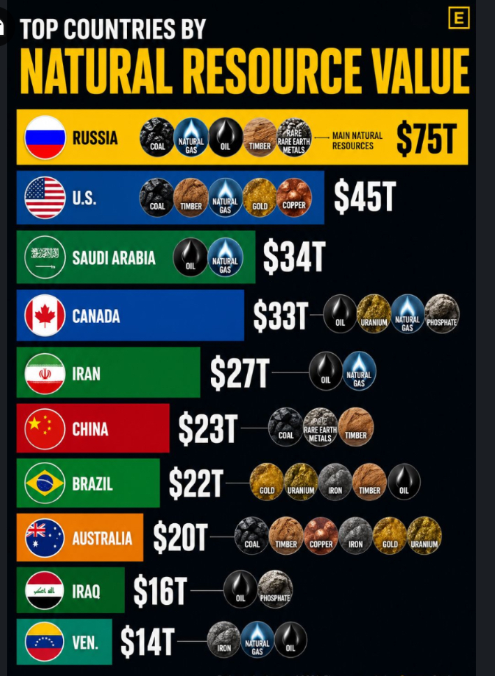
We now see the top countries by natural resource value. It gives me my validity as the United States is show to have $45T in value and that is the setting that makes them optionally almost insolvent. Their debt is growing faster and faster and as it is now said to be $38.9 trillion, which amounts to exceeding 100% of their Gross Domestic Product (GDP), but as we see it, they have almost spend the total of their natural resources. I have an issue with that, because the rare metals are not in that list all whilst Wyoming, Utah, Colorado, New Mexico, and Arizona have it, as such that number is off (by a lot) and other nations have more (or less) natural numbers as the chart sets out, all whilst these numbers are not given either as such it is a nice chart, but incomplete and as such redundant. If I was to hazard a guess, this was a chart to show how ‘good’ Russia is doing, but as I never saw data on it all as such I have my issues with it. All charts look pretty cool, but cool doesn’t pay the baker (or the butcher for that matter). As such we need to wonder what the chart was doing, not what they tell you, but what they aren’t telling you.
That was just my setting on this and there is a lot more to consider so whilst the first chart gave us “The U.S. hosts 17% of the world’s migrants”, my initial question was “Based on what data?” And as people m ight give us the setting that the AI gave them the numbers and we know that AI doesn’t yet exist. We are given the thought that it is merely DML and that is done by a programmer and that programmer might miss a few beats to be optimistic (many more beat are likely to have been missed) and all this on flawed data?
So what was the designer of that chart trying to persuade you to consider what was ‘their’ issue? Because when someone makes a chart, they want you to look into a specific area, or not look in an area that also mattered. Have a great day, another Monday parked on front of my door, Vancouver still has the bulk of Sunday to get through. Ah well.
